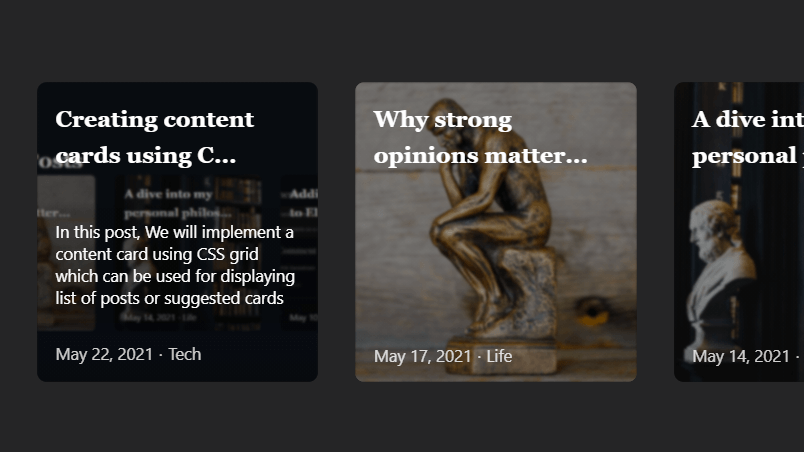
I have always avoided CSS grids and preferred using flexboxes in places where grids would have been the better choice. I finally decided to overcome the fear and finally explore it. In this short post, we will implement a content card using CSS grid which can be used for displaying a list of latest posts or suggest similar posts in an eleventy blog. It should be straightforward to convert it to the other Static site generators.
We will create a component in nunjucks that takes an input array of eleventy posts and creates a card listing. The component will also optionally take a value that decides if the component places the card in a single row with horizontal scrolling support or allows the listing to span multiple lines.
We first create the nunjucks template for the suggestion cards.
suggestedPosts.njk
<div class="suggested-postsList {% if suggestedPostScrollHorizontal %} grid-horizontal-scroll {% endif %}">
	{% for post in suggestedPosts %}
		<a class="suggested-item" href="{{post.url}}">
			<img src="{{post.data.mainImage}}"  loading="lazy">
			<div class="content flex flex-column w-100 h-100">
				<h2 class="pa1">{{post.data.title | trimTitle }}</h2>
				<div class="description flex-grow-1">{{post.data.content | trimContent | safe }}</div>
				<div class="date">
					{{post.date | formatPostDate }}
					<span aria-hidden="true">⋅</span>
					{%-  for tag in post.data.tags -%}
						{%- if tag != "post" -%}
							<span>
								{{ tag }}</span>
						{%- endif -%}
					{%- endfor -%}
				</div>
			</div>
		</a>
	{% endfor %}
</div>
The "suggested-postsList" div is the container for the list of cards. The configurable option that will scroll the grid horizontally instead of shifting the cards to a new row can be set by setting the value of the suggestedPostScrollHorizontal to true using the nunjucks set directive in the parent layout.
{% set suggestedPostScrollHorizontal = true %}The SuggestedPosts is an array of eleventy posts set in the parent layout and all the posts in this variable are listed by the component. Therefore, any filtering of the content must be done before the array is before the component is called.
{% set suggestedPosts = collections["post"].slice(0,6).reverse() %}Now that we are done with the nunjucks template, let us add the CSS for the component to complete it. The CSS is pretty straightforward. It utilizes a simple CSS grid with an image covering the entire span of each component. It is necessary to add an overlay over the image to make the text on the card readable. We apply it using gradients. The smaller text sizes need a darker gradient and hence we add a second background gradient on those elements. To add for some interactivity the post content is visible only on hover.
index.css
.suggest-card{
	width: 100%;
}
.suggested-postsList{
	display: grid;
	grid-template-columns: repeat(auto-fill,minmax(245px,1fr));
	grid-auto-columns: 300px;
	grid-gap: 2rem;
}
.grid-horizontal-scroll {
	grid-auto-flow: column;
	overflow-x: auto;
}
.suggested-item {
	height: 300px;
	position: relative;
	border-radius: 10px;
	overflow: hidden;
}
.suggested-item::before{display: none;}
.suggested-item img{
	z-index: 1;
	position: absolute;
	width: 100%;
	height: 100%;
	top: 0;
	left: 0;
	object-fit: cover;
	filter: blur(1px);
	transition: all 0.2s cubic-bezier(.4, 0, .2, 1);
}
.suggested-item .content {
	z-index: 2;
	width: 100%;
	color: white;
	position: relative;
	background: linear-gradient(to right, rgba(0,0,0,0.4) , rgba(0, 0, 0, 0.4));
}
.suggested-item .content h2{
	font-size: 1.25rem;
	margin: 0;
}
.suggested-item .content div{
	background: linear-gradient(to bottom,  rgba(2,0,36,0) 0%, rgba(0,0,0,0.12) 10%, rgba(0,0,0,0.2));
	font-size: 0.9rem;
	line-height: 1.2rem;
	color: white;
	margin: 0;
	transition: all 0.2s cubic-bezier(.4, 0, .2, 1);
	overflow: hidden;
	padding:1rem;
}
.suggested-item .content div.description{
	opacity: 0;
	transform: translateY(10px);
}
.suggested-item .content div.date{opacity: 0.8;}
.suggested-item:hover > .content div.date{background: linear-gradient(to bottom,  rgba(2,0,36,0.2), rgba(0,0,0,0.2))
}
.suggested-item .content div p{margin: 0;}
.suggested-item:hover > .content div.description{
	opacity: 1;
	transform: translateY(0);
}
.suggested-item:hover > img{
	filter: blur(2px);
	transform: scale(1.1);
}
Now that we have the entire component ready, it can be used to display the latest posts or whatever one can imagine in the form of cards. A couple of examples of the components with and without horizontal scrolling can be seen below.
You may also find it at the end of this post if you are reading on a smaller screen.
Until next time, ciao!
 Cards using CSS grids

There are currently no comments on this article, be the first to add one below!